21. Text: Hierarchies
Text Recap of the Previous Video
Hierarchies
Try this: Create a new sheet, drag Order Date to Columns and Profit to Rows. You should see a line plot, this is Tableau's default for time data. There is a little plus symbol on the Order Date pill now. Click it and see what happens.
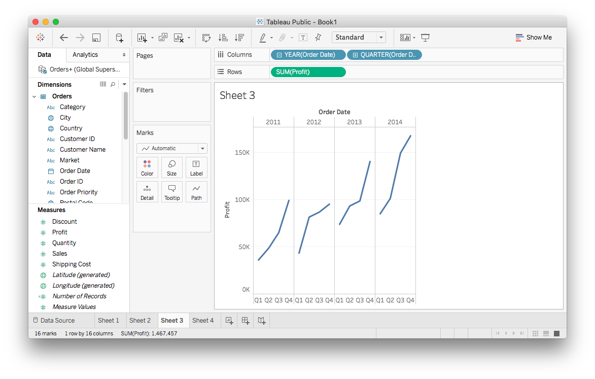
What you've done here is "drill down" into the hierarchy starting with the yearly data then grouping it by quarter. Tableau automatically makes a hierarchy of time periods from date and time data fields. As you drill down, you get more fine divisions, from year, to quarter, to month, then day.
You'll notice the pills have a little minus sign in them now. Clicking on it will go back up the hierarchy.
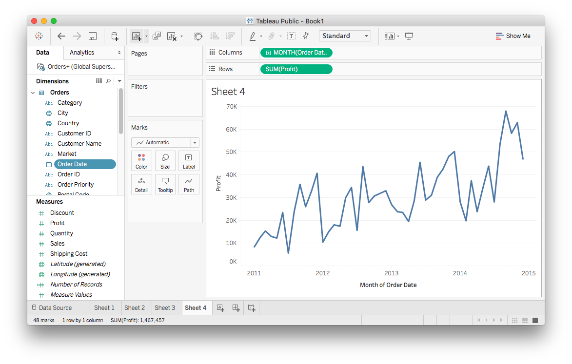
You can remove levels of the hierarchy from the plot by dragging the pill out of the shelf. For instance, if you drill down to Month then remove Year and Quarter, you'll see something like this:
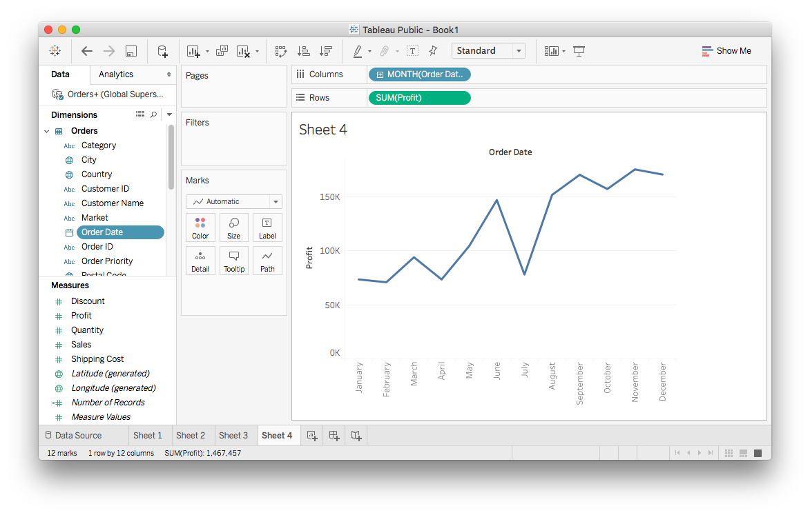
It might not be what you expect here, I expect this to show the monthly profit over the four years in the data. However, there is only one value for each month. Tableau is doing this because Order Date has been set to the discrete data type, so it's aggregating the Profit values for each month. That is, each value is the sum of Profit for that month over the four years in the data.
However, I'd typically like to see this as one long line over all four years. To change how this is being plotted, you need a continuous axis and to convert Order Date to continuous data. One thing you can do is to open the Order Date field menu (right click, or left click the triangle) and select "Convert to Continuous".
You can also open the menu on the Month pill and convert it to continuous from there:
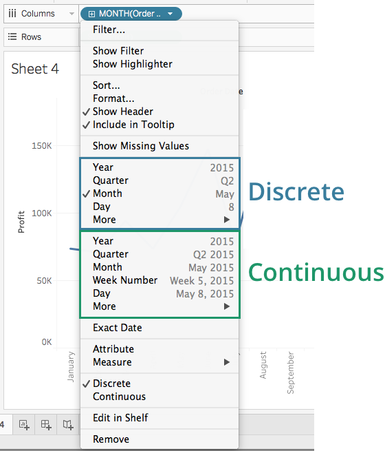
If you select "Month" in the continuous section, it'll switch to a view with the monthly profit over the whole time range. Try it yourself.
You should see a plus sign in the pill, this will also let you drill down further so you can see weekly profit. However, there is no minus sign now, so you can't go back up the hierarchy from there.
Manual hierarchies
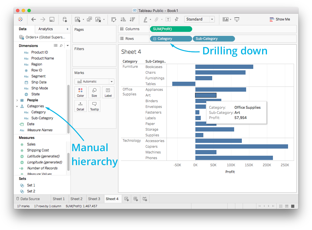
Tableau created the hierarchy from the date automatically, but you can also create your own hierarchies. For example, each value in Sub-Category belongs to one in Category. For example, a record with the Sub-Category value "Bookcases" always has a Category value of "Furniture." There is a hierarchy here where the Sub-Category values branch out from Category values.
You can make a hierarchy by selecting both Category and Sub-Category (control/command-click both fields), then opening the menu and selecting Hierarchy > Create Hierarchy…
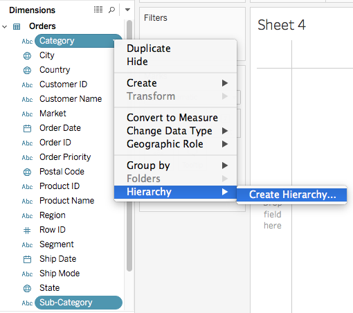
Now you can create a new hierarchy and give it a name. I named it "Categories". It shows up on the left and you can drag it to the shelves just like a normal field. But now it starts with "Category" with a plus sign, you can drill down to "Sub-Categories."
